

Sagewell
Sagewell is a pioneering financial wellness platform for seniors who live on a fixed income. Its primary goal is to help retirees navigate all of their financial challenges and goals with confidence and assurance.
Having already driven a successful stake in fertile grounds of the neo-banking industry, Sagewell needed to not only stand out further from its competition but firmly establish a brand that was truly able to empathize and connect with its audience on a human level.


Approach
StudioRd Design worked closely with the Sagewell leadership team to understand their audience more deeply and fully realize the assortment of factors that seniors on a fixed income face every day – factors that constrain the sense of freedom all retirees deserve.
Our strategy involved establishing a primary level of trust with this less technically-savvy audience so they could feel comfortable having their financial needs addressed in a digital ecosystem.
Solution
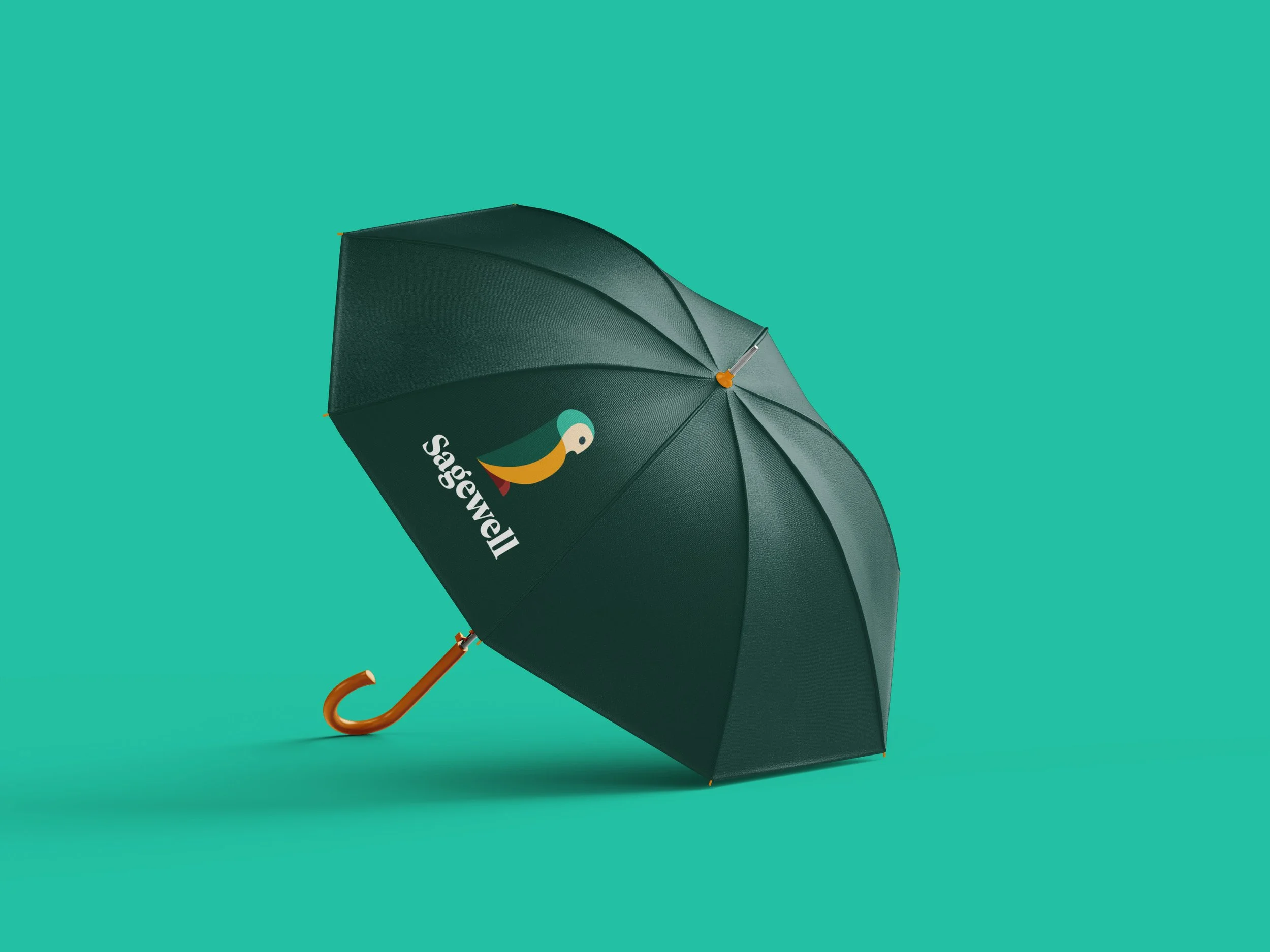
With a name like Sagewell, it was imperative to support the notion of wisdom and guidance with appropriate visual cues, and in this instance we relied on an animal archetype – the owl, which has (historically and anecdotally) always conveyed a sense of intelligence and clear-sightedness.
The owl is statuesque and forward facing, representing a pillar of support for the future while at the same time avoiding associations with less favorable tropes that are commonly linked with other well-known, front-facing brand-mascot owls.


“John and the StudioRd Design team helped us create a mark and identity that imbued the sense of wisdom and compassion we were aiming for. The new identity not only helped us stand out in our market but has had a notable, positive impact on our sales cycles and customer acquisition efforts!”
Sam Zimmerman
Co-founder and CEO, Sagewell


Services
Positioning
Brand Foundation
Visual Design System
Tone and Voice
Brand Guidelines
Collateral
